Crayola
Free the “What If”
The Crayola redesign was one of the most ambitious and rewarding projects I’ve ever worked on at Big Spaceship—or anywhere else for that matter. The digital team at Crayola was incredibly stimluating and only settled for our best work—the type of challenge I enjoy. I’m so proud of the team and what we accomplished for Crayola and their users.
Here are few of my favorite highlights from the process.
Components
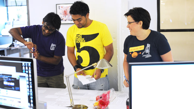
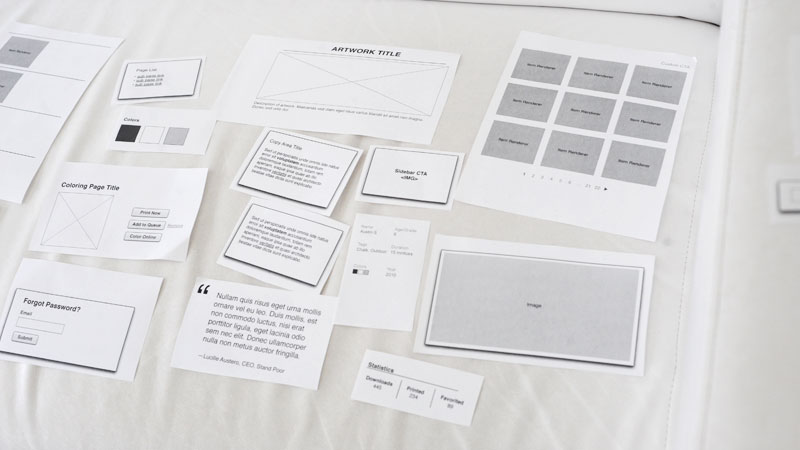
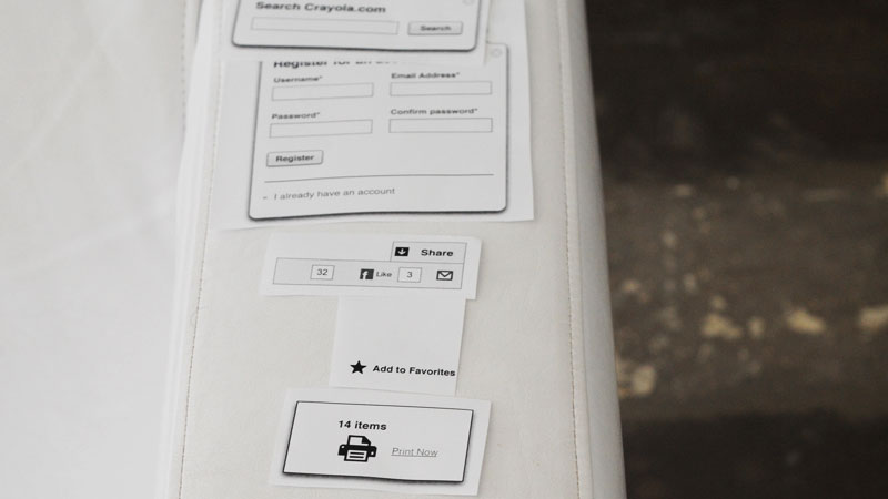
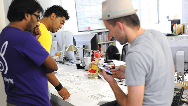
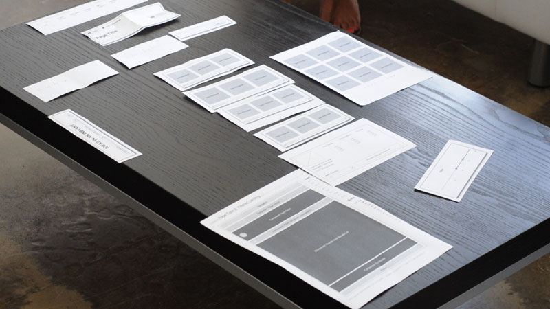
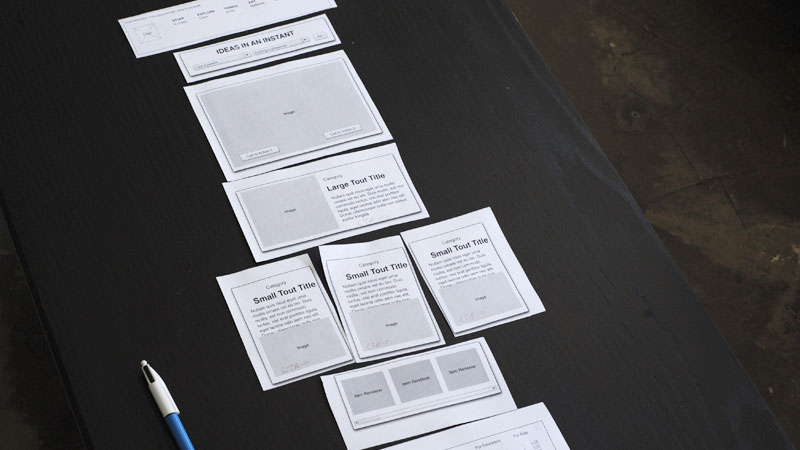
With thousands and thousands of pages on the Crayola site, it wasn’t efficient to wireframe every single page and state. We created a system of components that could be assembled in different configurations to accommodate the unique content needed for each type of page. Paper prototyping to the rescue!
IA & UX
Wrangling the amount of content on the site was no trivial pursuit. We created highly detailed information architecture and user experience documentation that served as our bible for the project. If anything ever got hazy along the way, our trusty UX binder held the answers to put us back on track.
Telling Stories
Tagging structures are complex beasts. After many a wireframe and phone calls, I just wasn’t doing a great job explaining how a relational taxonomy should work across the site. We went back to the drawing to simplify the way we were explaining the concept and came up with a simple storybook format. The name of our lovely tale was, “Once Upon a Tagging Hierarchy.” It forced us to simplify the things we were trying to say, everybody finally understood what we were talking about, and we all walked off happily into the sunset.
A wonderfully responsive design
Although we initially scoped a separate “mobile phase,” we quickly switched gears and opted for a responsive design after an inventory of all of our content. It was important that most of the content remain intact across devices and screen sizes, so responsive design was a great approach for the new site. On top of the layout adjustments, we built in a few capability-specific enhancements, like collapsing elements on smaller devices and prev/next buttons for carousels on touch devices. Keen!
Doodads
What better way to show how great Crayola’s products and ideas are than to show what real kids have made with them? Each page features a randomized assortment of authentic kids’ drawings—affectionately called “doodads”—for your very own viewing pleasure.

Ideas in an Instant
Because of Crayola’s commitment to being a great resource for parents and educators, one of my favorite content ideas for the site was Ideas in an Instant. Users can quickly select from a list of a few choices to get immediate inspiration for what to do with their kids from anywhere on the site.
And of course, perhaps my favorite part of the site.
http://crayola.com/404/