Why I Love the Netflix Redesign
Yesterday, Netflix launched a new version of their homepage. I casually mentioned my affinity for it, and found a lot of opposite reactions to my own.
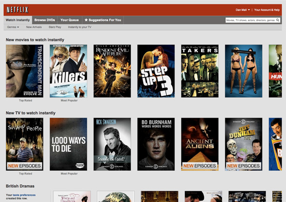
I’ll be honest: visually, it’s not great. Wayfinding based on rollover feels dated, at least the way it’s implemented here. Rating movies and accessing detail pages seem to be much more difficult.
But the thing that gets me excited, the thing that’s more courageous than a lot of redesigns I’ve seen in a long time is what Netflix has prioritized. They sacrificed many of the things that make a good visual design—typography, whitespace, composition, and more—and optimized for what has made Netflix last as a brand: the ability to easily find and watch movies. This page is packed with movies. On a conceptual level, that’s brilliantly obvious and obviously brilliant.
Fixing bugs is easy. Changing interaction models from rollover to click is cake. Fixing a broken concept is much harder.
It’s incredibly easy to react to what’s in front of your eyes. It’s much more difficult to perceive intent. Try to see past what’s on the surface; find the reasons behind the output, the chain of events that led to what you see.
Could this redesign have been as good while still incorporation the tenets of beautiful visual design and useful interaction design? Absolutely. But we all know that redesigns come with compromises, especially for a site with this scale of traffic. Timelines, budget, resources, and many other factors often add to tarnished results that make us unhappy as creators. However, Netflix seems to have overcome those hurdles to produce a site that lets the new concept shine through, even if the visuals have to catch up. That’s no small feat, and I believe they should be applauded for it.
What about you? Agree? Disagree?
Article Info