You’re on an old version of this site. Please visit danmall.com for the latest.

A responsive redesign

Initial Contact

4 Dec 2012

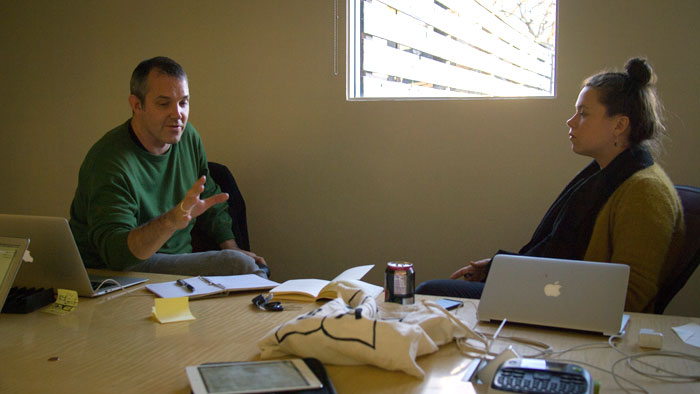
I get an email from Josh Clark, an internet friend that I’d never actually met before. Josh tells me that he needs a designer for a few projects coming up and that he’d love to work together, which was music to my ears. The first project he has on the horizon is a responsive redesign of TechCrunch. We continue to flatter each other for a few emails as we discussed rates and timelines, and Josh tells me about the potential all-star team of interaction designer Jennifer Brook, front-end designer Brad Frost, mobile strategy consultant Jonathan Stark, and project manager Kristina Frantz. Sold!

Regroup

10 Dec 2012

We chat for the first time as a team about how we could work together. Josh writes an amazing proposal, and TechCrunch is interested in talking with us further.

Snacks

19 Dec 2012

I go to New York to meet with Josh. We chat at One Girl Cookies over cupcakes and cookies, the way proper meetings should go.

Prescreen

21 Dec 2012

Our first call with TechCrunch as a group. We talk about things like how we’d work together as a big team, how quickly we can be iterative, how invested they are in trying to achieve a great design they’re proud of, and how possible it was to get quickly into code.

Awarded

31 Dec 2012

TechCrunch sends us the good news that they want to partner with us for the project. Happy almost new year!

Pre-game

14 Jan 2013

Our team ships out to San Francisco to kickoff with TechCrunch. We spend a day prepping.

Kickoff

16 Jan 2013

Kickoff! We take the team through some prioritization exercises, gut tests, and design studio exercises.

Timberlake

16 Jan 2013

A day after the new Myspace launches, TechCrunch publishes an article about the redesign during the kickoff meeting. We dub the project “Codename: Timberlake.”

Influence

18 Jan 2013

I immediately start an “influence” folder to catalog some patterns I think could work. I also jot down a list of elements I have ideas for in order to start my element collage:

  • TL;DR section
  • Breaking news alert
  • Crunchbase data card
  • Feature authors
  • Recirculation
  • Feature stories
  • Quote to sum up event
  • Types of image slideshow
  • Blockquote data-attribute

Element Collage

30 Jan 2013

Information architecture and development work are already in full swing. Regarding design, I post an element collage created in Photoshop to start discussions about general art direction for the new site.

Typography & Color

6 Feb 2013

The TechCrunch team gives some great feedback about this initial pass. Summary:

  • Can we explore other color palettes that involve less green?
  • Can we explore different type treatments, possible lighter ones to accommodate more dense headlines?

I pop open Photoshop and Typecast and start setting some type.

The River

20 Mar 2013

I’m thinking pretty deeply about how to really drive home this idea of the river, a chronological stream. I see all of the posts as historical points within the same axis of time, and I want to graphically communicate that. There’s also a lot of meta information related to each point and time. I call them “flags,” but a more accurate metaphor would be something like “buoys” or “mile markers.” Here are the first few iterations of that idea.

I even create a few motion studies about how the interaction could work on smaller screens.

Tweaking

22 Mar 2013

By now, all of the major patterns on the site exist in HTML and CSS, and I’m working closely with Brad to tweak some one-off designs that need some extra design love. Most of my time is spent between Photoshop, After Effects, Flash, and Sublime Text (I’m making quick and dirty interaction prototypes for Brad, while he’s turning them into production-level code that works within the pattern library). The majority of the “deliverables” are happening in-browser.

For the next 3 months, I’m focusing on being design support, making views for Brad and Jonathan that aren’t yet defined. That includes things like rollover states, animations, pullquotes, “breaking news” elements, article intro styles, and more.

Design Audit

14 Jun 2013

If you haven’t already inferred it, this was a massive project. Brad’s already been working a ton on these templates. Being the anal-retentive designer I am, there are a handful of things that I want to tighten up. You know, the extra 1%… that extra polish that makes a site really shine. But, I didn’t want to overload Brad. Dilemma!

I decide to take the chance and mention to Brad that I’d like to put together a list of some tweaks that I’d like to make and that we can decide which ones are high priority enough to make. I cringe while I wait for the reply.

Brad responds with one line: “Pour me a cup of coffee.” This is why I love him like a brother.

I make some Photoshop motivation for Brad and get crankin’ on a Google doc for the desired changes:

A little while later, Brad returned with most of the changes done. To my surprise, he had the complete opposite reaction than I though. Instead of being disgruntled about the changes, he was energized about them. “Everything is so much tighter,” he said. “I’m loving this site all over again.”

Launch Day

15 Oct 2013

The new TechCrunch site launches! Our friends at TechCrunch write up some of the details of the redesign. Not surprisingly, some people hate it. But surprisingly, some people don’t! In fact, we even spot a few words like “great work,” “like,” “better,” and one “much, much, much, much, much improved.” Not too shabby!

Wrap Up

18 Nov 2013

To say I learned a lot while working on this project is an understatement. Sometimes, responsive design is hard. Design is hard. Business is hard. But because I had the opportunity to work alongside people that are some of the best in the world at what they do—and yes, that includes the client too—and everyone was working towards the same goal of a great site for both TechCrunch readers and writers, it’s easy to be proud of the results.

Special thanks go to the great team at TechCrunch for really being invested in creating a great site. COO Ned Desmond & Director of Product Christine Ying really drove the ship in communicating a great balance of what was both aspirational and practical. Co-Editors Alexia Tsotsis & Eric Eldon; Senior Editor Matt Burns; Executive Producer/Production Director, TechCrunch TV Jon Orlin; and Senior Manager, Audience Development Sean Nakamura were tough but fair stakeholders that did a great job of letting us know what would benefit them from a content and workflow perspective. Senior Software Engineer Alex Khadiwala, Lead Engineer Vineet Thanedar, and Technical Manager Kaushik Jadav held down the dev end to ensure the quality of our front-end work all throughout integration. Luke Gedeon and the 10up team expertly handled the WordPress VIP build.

Visit the site: TechCrunch.

For more perspectives, read:

blog comments powered by Disqus

Article Info