Design Flexibility
The design process in the public story of a new site for Reading Is Fundamental
We last left off talking about Element Collages, which RIF was really thrilled about. They loved the first stabs at the marriage of content and design ideas. We were on cloud nine!
The next step for us was to finalize the site architecture (more on that in another post) and then show how the design system could work smartly to create any permutation of pages necessary. Because of the wealth of content on the site and the need to access that content across a range of browsers, devices, and operating systems—read: responsive design—it wouldn’t have been efficient to try and design every page on the site. Instead, we focused our time on creating flexible elements and shells (hero areas, main long-form content, callouts, etc.) that could accommodate many different types of content. The specific configurations of these elements are what we call “templates.”
The first thing we showed RIF was an example of a detail page template. I often start with a page that’s deep within site because it can communicate a good sense the actual content and it’s a likely entry point for a new visitor, either from a search engine or a link. I also tend to show templates in pairs or groups of different sizes, not as a comprehensive showing, but as examples in the range of views. I’ll show a small screen view like an iPhone-sized portrait canvas, because a mobile-first approach to design can really be a great framing mechanism for content and hierarchy. I’ll also show what I consider to be a medium-width view, like an iPad-sized portrait orientation. That particular width (768px) tends to be problematic for me if I’m not thinking about it early in the design process, so I like to get it out of the way. It’s much easier for me to figure out what to do when I have more space, but significantly more difficult to decide how a design gets crammed into smaller widths.
Also, though I come from a Rule of Three mentality, the more I design, the more I prefer working on one version that gets many iterations instead of many versions that get fewer iterations. Iterations trump versions. As we strive for truer design and content parity, I'm reminded that designing systems is more pottery than archery.
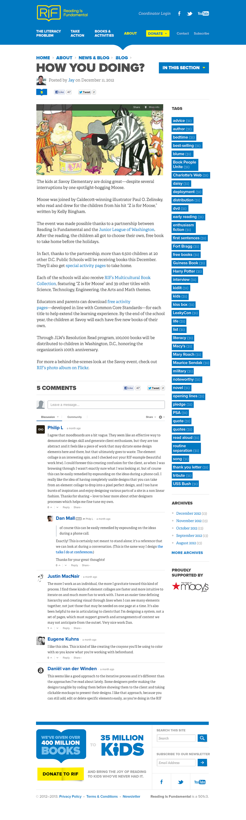
Here’s the first template we showed:
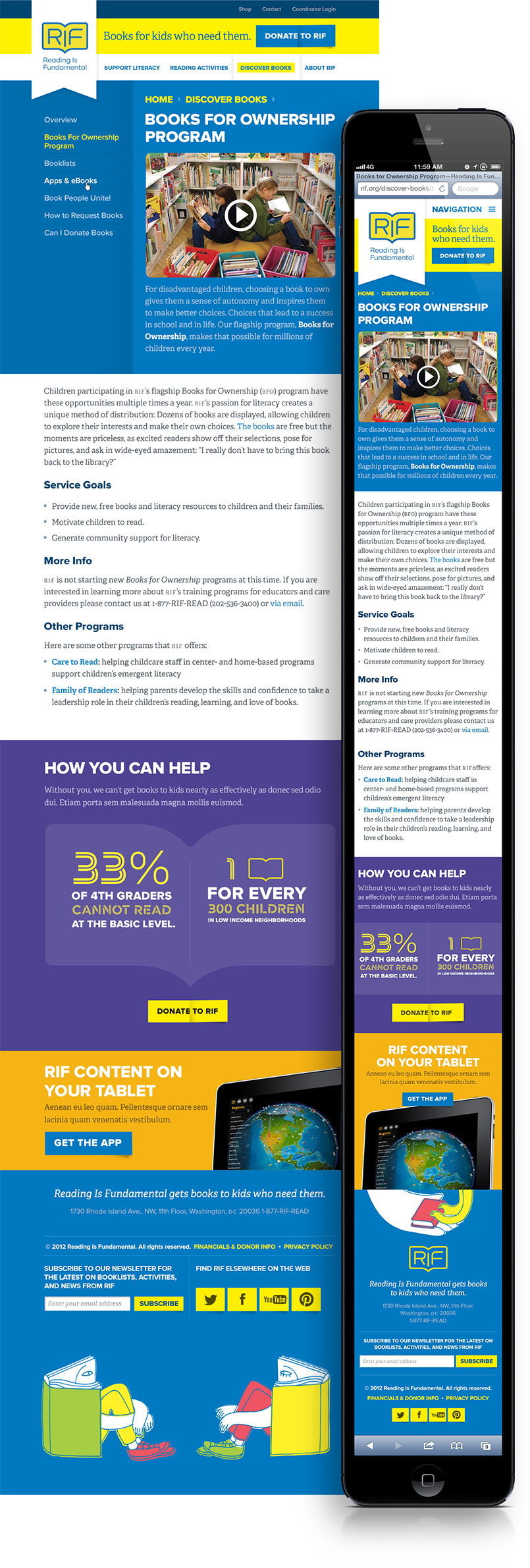
Our team felt pretty good about this design. RIF politely hated it.
We asked them to write up feedback via Basecamp before having a call with us to discuss the details. Their post to us started like this:
Just want to give fair warning that this is our least favorable feedback to date.
We’re still very excited about the design elements presented in the initial design reviews. However, this latest round that represents many for those elements pulled together has missed the mark for us. And to be honest, we’re not quite sure how or why. Nonetheless, I’ll do my best to explain.
They then proceeded to give us incredibly articulate and thoughtful reasoning as to what wasn’t working in this design. They mentioned everything from…
- Making interaction and engagement easier for users than their current site does
- Distinguishing themselves from other similar organizations
- Workflow issues they wanted to eliminate
- Emotional design baggage from their current site and previous sites
- Missing functionality
- Lots more
All things we heard in conversations with them, but failed to represent in the designs. Our job in being best able to serve our clients is to listen to them and act on the things that can make their business, their jobs, and their lives better. We only did one of those two, so we definitely still had more work to do.
Back to the drawing board
Designing a large site is a lot of work for designers (obvious statements be obvious), but it’s also a lot to process as a client. This time around, we decided to break our design up into smaller elements that we could iterate on faster. We decided to tackle the header first. In a few hours, we had a few iterations of a newer header prepared:
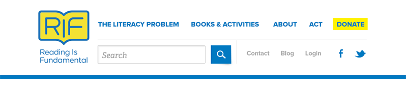
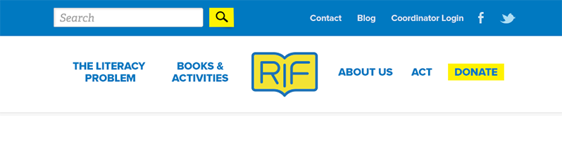
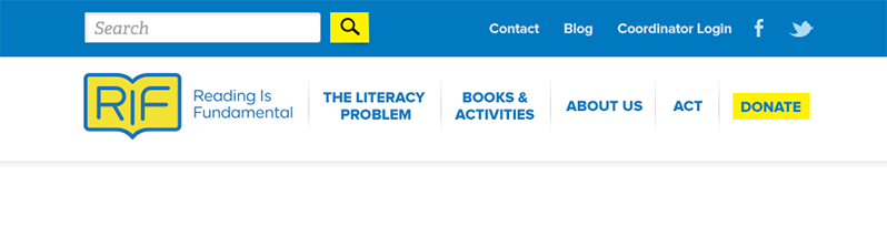
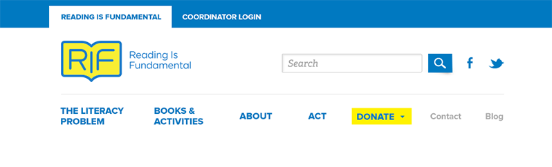
They gave us some quick feedback, and we turned around some new iterations:
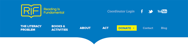
They thought the last one worked perfectly, and just like that we had a finished piece in a few hours. On to the footer!
With a few small copy changes, the first footer was a clear winner. Within a day, we had iterated through a significant number of revisions on some major element for the site and gotten them to a good place.
One added bonus was that we were starting to create a good rhythm as a team. We had the momentum of knowing how to have effective conversations together and creating designs that served the proper goals. We were encouraging dialogue instead of presenting; the work was better for it and everyone was happy.
We moved quickly to interior templates and eventually a home page.
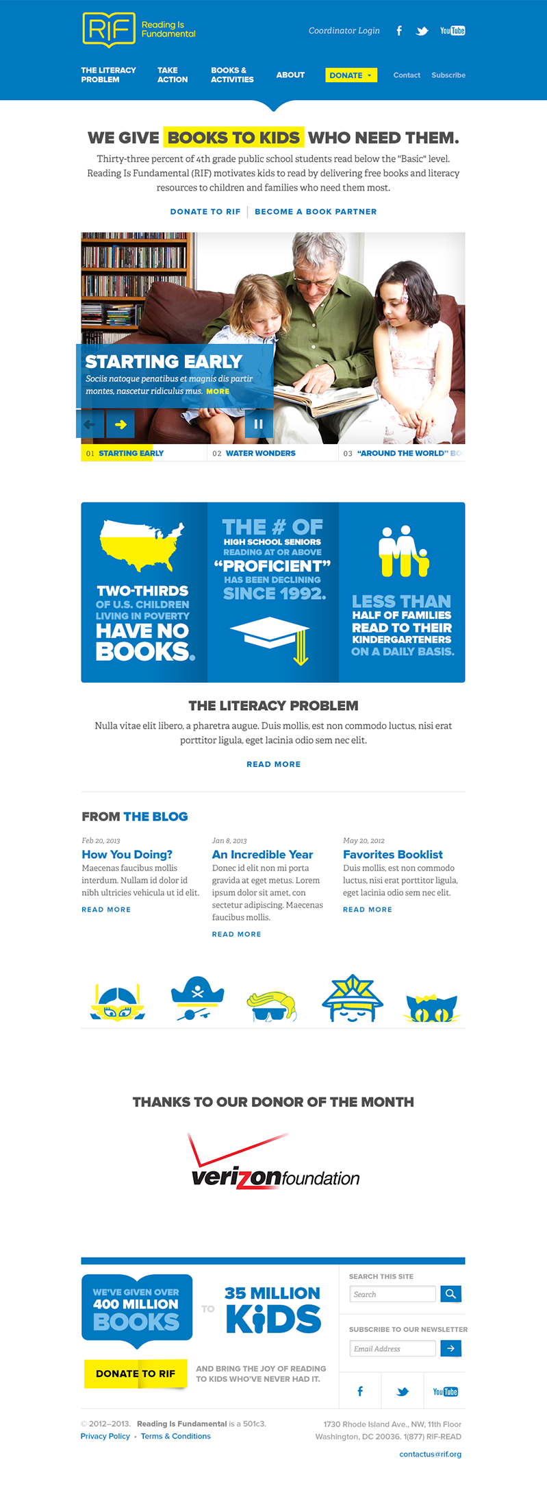
This time, our Basecamp post for feedback started differently:
Heavens to Mercatroid! We love it!
While we’re still working through some finer details, RIF feels much more confident that we now have a design system that will serve their goals well. There’s a lot more that can still be said about our design process, but I hope this small look gives you some more insight as to how this project is progressing. As always, you can follow along by regularly checking our RIF client site where we post our latest to RIF. We often post to that page faster than we can write up the process here, so that’ll be your best bet regarding real-time progress.
More to come!
Article Info