The Responsive Mobile Entertainment Weekly Site
Earlier this year, my friend Josh Clark invited SuperFriendly to partner with him to do some mobile work for Entertainment Weekly. Josh put together an all-star team: himself at the helm doing strategy & creative direction, Robert Gorell on information architecture and user experience, Brad Frost slinging markup and styles, Jonathan Stark writing JavaScript, and Kristina Frantz project managing. We also worked with 10up, who handled the back-end development.
On the SuperFriendly end, I oversaw the design direction and Matt Cook produced our side of things. We also invited guest star Scott Cook to handle art direction and design.
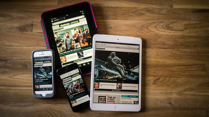
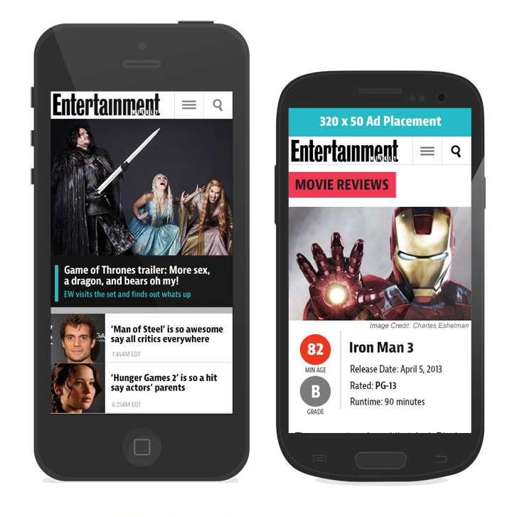
For you impatient ones, we made a responsive mobile site for Entertainment Weekly: m.ew.com
Still with me? Here are a few things I think are worth sharing about the process.
Starting strong
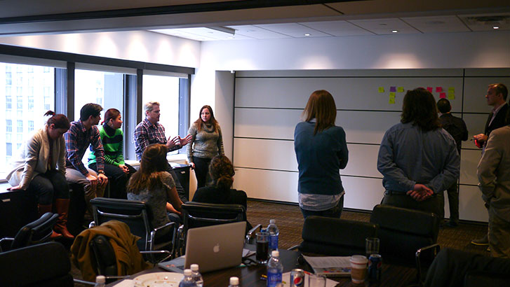
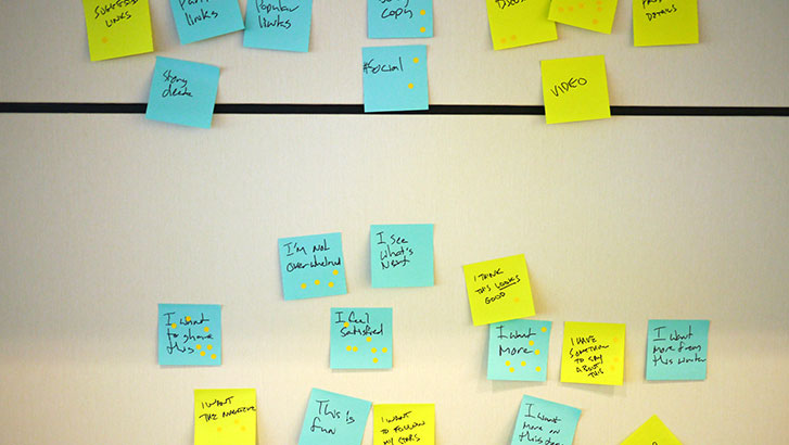
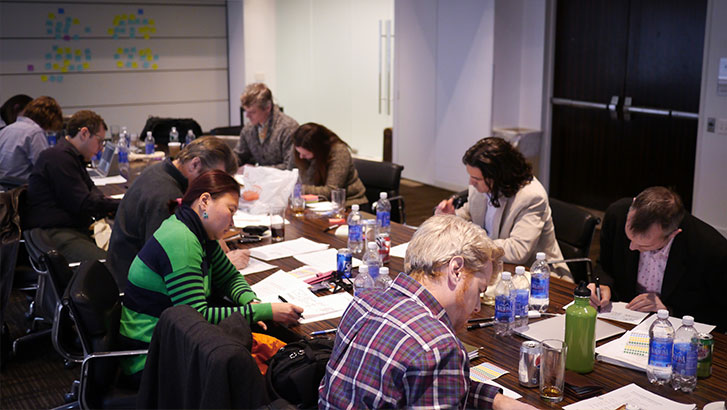
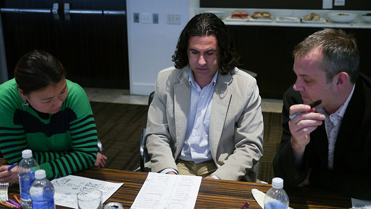
Like any good project, we started by spending some time in-person with the EW.com team. We heard from every team about what they want their workflow challenges and desires. We used the design studio methodology, the KJ technique, and did some one-on-one interviews, among other things. After a very productive day, we had a great sense of what we could do to make the site better for its readers and easier for the staff.
Art direction & design through element collages
At the same time, Scott and I were working on the overall art direction and making sure we were capturing the right tone for the brand. The design process for this site was one of the smoothest I’ve been through recently, and a lot of that is due to Martin Schwartz, the art director on the EW.com side. One of the first things Martin put together for us was what we called a “design care package,” a collection of fonts, vector logos, visual patterns and texture libraries, and—tada!—a style tile that they made internally a little while before our project started.
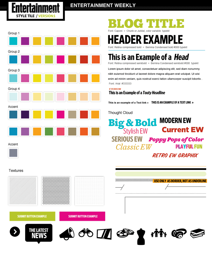
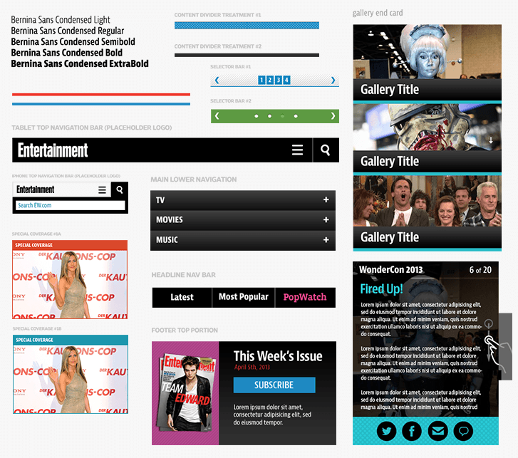
Since we’re in a post-“full-comp” era, we knew we needed to be thinking more high-level about the visual style. Naturally, we turned to creating some element collages. After talking Martin through the idea, he was completely on board. After a few iterations, we ended up with something like this.
In Brad’s write-up for this project, he says this about the development process using an atomic design methodology:
A site’s going to have a header and footer… I was pretty sure there’d be some articles, so we’d need headings, lists, blockquotes, and the like… People would want to search so I made a search form. They’d want to comment, so I made a comment form. I was pretty sure there would be a homepage, an article page, some sort of section page. You get the point.
Not coincidentally, that’s the exact same way I suggest making an element collage. Take the things you know will exist—or that you’re the most excited to make—and start putting them on a canvas, whether in a graphics program like Photoshop, HTML/CSS in a browser, or anything else you choose that helps to get it out of your head. Not only is it a great way to inventory the elements you’ll need, but you’re also inadvertently teaching yourself to design systematically.
What Brad was doing in code and Robert in sketches, we were doing in pixels. That allowed everyone to be less concerned with “finishing” what they were doing individually and instead let someone else pick it up in his respective medium, which made for an significantly faster and more iterative process. When everyone on the team is doing the same thing and working the same way within their own respective disciplines, you’re on the right track.
Testing the system
Architects will often make both blueprints and 3D renderings because it helps to round out the picture of a) how an edifice is built and b) what it will become. However, they also know that there’s nothing like visiting the actual construction site.
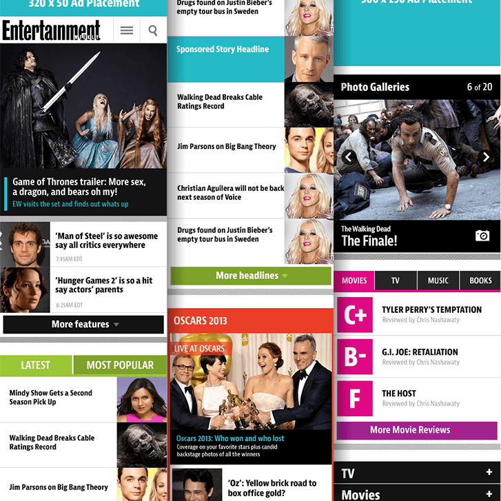
We ended the visual design process by creating a few full pages, not because the client asked for it, but, like architects, because we wanted to make sure they fit together nicely. All this happened in tandem with architecture and development work. By starting early with an in-browser build—our construction site—that slowly adopted more and more of the art direction, we found that it was much easier to have appropriate discussions at the appropriate times. We all had the same picture of what we were making, and once we got there, it wasn’t a surprise to anyone. It’s what we imagined all along.
EW and Global Moxie, sitting in a tree…
All together, having an open-minded client that was willing to trust us with process allowed us to move really quickly and not waste time on anything frivolous. The collaboration between two great teams makes for a dang good product that we’re all really proud of.
Read more
For some other perspectives, check out these posts from other members of the team:
- Making of: Entertainment Weekly’s Responsive Mobile Site, by Josh Clark
- Entertainment Weekly, by Brad Frost
- Entertainment Weekly, by Jonathan Stark
Article Info